

Zeitro
BRIEF
In summer 2019, I interned at Zeitro on the App team.
If you are not familiar, Zeitro is a startup company working as an online intelligent mortgage broker. It helps users hunt for their fair mortgage rates.
We created the new website and digital illustration.
PROJECT DETAILS
By: Renfei Wang, Jay Yuan, Clement Ng, Bochen Wang
Role: UX/UI Design, Research, Prototyping
TOOLS: Adobe Illustrator, XD, Photoshop, ProtoPie

Zeitro’s Key Process
We first summarize the main processes for users of getting a mortgage through Zeitro. Start to think about what might stop users and confused users during these processes.

USER STUDY
Understand user, know what they want
Zeitro services for two types of users. The primary type of user is First Time Mortgage Buyer, and the second type of user is the Experienced Mortgage Buyer.
Persona
Constantly remind us to design for them
CASE A: Mary’s Story
“Hey, my name is Mary Smith, an HR manager in a technology company. I currently live in a rented apartment with my husband and my son. We decide to buy a house and prepare for a new sibling.
We never bought real estate before and know a few things about it. We are acceptable to the new pattern industry. We want to know more about the mortgage and find a good loan. We also hope to complete the mortgage process quickly.”


CASE B: Sam’s Story
“My name is Sam, a writer in California. I own serval real estate and invest my house to earn the rent fee. Recently, I find a great apartment and decides to purchase 2-4 rooms to rents it out.
I might accept the new pattern industry if the company can find a low-monthly payment loan for me. Don’t cheat me, I am pretty familiar with mortgage and sense to it. However, I am not good with modern technology.”

DESIGN CHALLENGE
How might we help users finish the online mortgage process themselves, even if they don’t know mortgage well?
EMPATHY MAP
Different user, different needs
According to the persona, we mapped out the user journey of our persona, including their thoughts and feelings. We tried to find out the problems they might face during the 4 main processes.
Mary’s journey

Sam’s journey

Summarize
With the current experience, users have some trust issues with Zeitro because they lack the acknowledgment of Zeitro. In addition, they don’t want to waste too much time on an unfamiliar company. Lastly, some users do not know mortgage well.

USER INTERVIEW
How to build brand trust of a start-up company?
If users don’t trust us, they would never move forward to our service.
We interviewed people in Bay Area from 25 years old to 50 years old. The interview took approximately 20 minutes and included topics to get to the essence of their worries. Questions includes:
Have you ever try online mortgage service?
Do you trust online mortgage service? Why or why not?
What might increase your trust to a new company? Or what would lower your trust to a brand?
When do you feel great about your online service?
INSIGHTS FROM INTERVIEW

DESIGN PRINCIPLES
We care about what you care

INFORMATION ARCHITECTURE
Based on these insights and research we had before, we designed the sitemap, which is the backbone of our website.


SOLUTIONS
We care about what you care
Vertical transition
The vertical transition makes users feel like the same step and they are filling a real form.
Recommend for users
Use users' information effectively and reflect the results to users. Let users feel the intelligence.
Online support
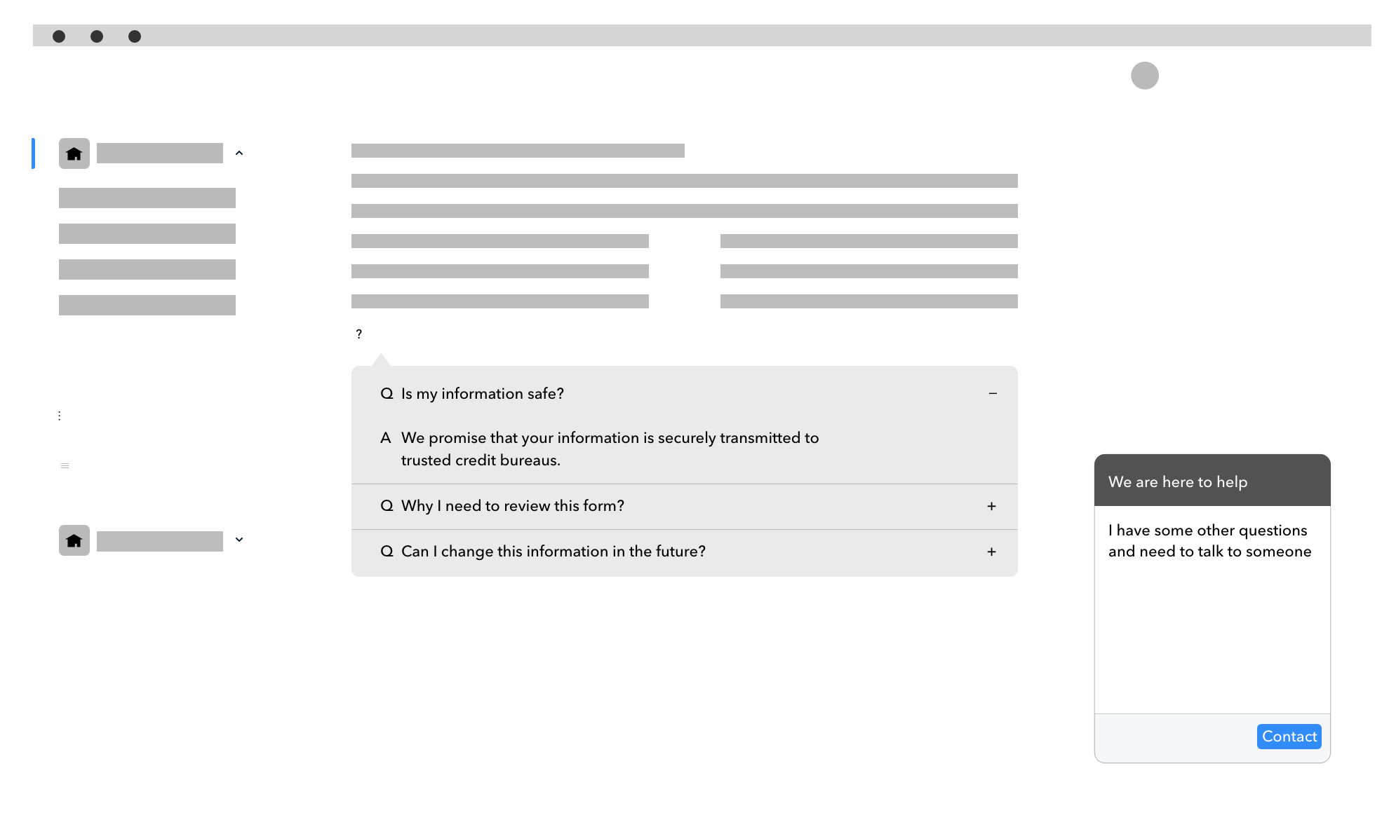
Explain the mortgage term, the reason why we made a decision, why we need the information and anything they might confuse. Make Zeitro be persuasive.


DESIGN
The Zeitro’s website is designed for users to finish their mortgage process with Zeitro by themselves, even if they don’t know mortgage that well.
Let’s take Mary's journey as an example:
Landing
Build brand trust, be informative, and get you start
Mary is looking for a low monthly payment loan. She found Zeitro online and felt Zeitro might be a reliable company when she saw some familiar companies logos on the landing page. After knowing the company and understand her benefit on “Modern-Day Mortgage” and “Why You Should Choose Zeitro”, she decided to give a try.

Matching
Minimize questions and maximize conversions
She then started working on the form. She can focus on one question at one time and vertical transition of the form didn’t make her feel there are so many steps. She liked the animation on the left and felt like she is building her dream house.

Your Results
Be personalized and customized
After matching, Mary saw the loan results based on the information she had provided. The “Support” function really helped her to understand why Zeitro recommends these loans for her.
She kept scrolling down and saw the education videos. These helped her understand the differences between the loans that Zeitro recommended.

Mary was curious about if there is a loan having a lower monthly payment. She clicked “Explore more” and saw a mass of loans. She adjusted her needs by the filter and realized Zeitro made a good choice for her.

Verification
Be professional, but still easy to understand
Finally, she chose a loan and ready for verification. Although there are a mass of questions, they are easy to understand and lead her filling in them one by one. She got support on each question she felt confused and felt this is much easier than write a paper form.

LEARNING
Design for users
Through the internship project, I realized that the goal of a persona is not just a process of UX Design. It constantly reminds the designer to design for users but not our biases. Also, it aligns team, business partner and engineers and makes our design persuasive. This project really makes me stand on Mary’s perspective and find solutions for her.